20 Homepage Designs That Get You Noticed in 2026
Your homepage has seconds to capture attention, communicate value, and invite users to explore further. But standing out in 2026, where design trends evolve quickly and user expectations are higher than ever, is no small feat. Striking the right balance between creativity, clarity, and functionality is a challenge many brands face.
Luckily, we have a list of examples to get inspired from
Whether planning a redesign or building from scratch, these standout examples will spark ideas and offer actionable insights to help you craft a homepage that truly connects with your audience.
Why Websites Need a Compelling Design?

Web designers focus heavily on homepage design; it’s where interest happens, or dies. Which is why it’s the first thing UX, branding, SEO, and conversion experts think about when designing a website. Homepage design gets special attention to its elements that shape user experience and business results.
In fact, 94% of a website's first impressions are design-based, highlighting just how important homepage design is for attracting and engaging visitors.
Let’s break down the key reasons in more detail:
1. It Forms the First and Fastest Impression

Visitors judge your site in under a few seconds. Professionalism, credibility, relevance — all of it gets sized up almost instantly. And that snap judgment is usually what decides whether they stick around or leave.
A homepage must have a clear visual hierarchy, typography, and a simple-to-follow layout. It answers three things fast:
- What this site is actually about
- Who it's built for
- Why any of that should matter to them
A lot of visitors won't scroll past the fold. So whatever matters most needs to live up top, not buried halfway down the page.
2. It Anchors Your Brand Identity
Your homepage is where brand identity either lands or falls apart. Color, type, imagery, tone of voice, all of it working together (or not) tells visitors something about who you are before they've read a single word.
When it's consistent, it builds recognition. It sets an emotional tone, trust, and creativity, and carries that through the rest of the site. When it's not, people feel it, even if they can't name why.
3. It Orchestrates User Flow and Site Architecture
People first landing is the homepage, but its true purpose is to lead the visitors to where to go next. Designers use nav placement, CTAs, and section structure to point visitors toward what matters like:
- Product or service pages
- Pricing Page
- Contact Us or Demo forms
The best homepages make navigation feel invisible. Users don't think about where to click, they just know. That comes from solid wireframing and UX thinking built in early, not bolted on after.
4. It Directly Impacts Conversion Rates

Every homepage is sitting inside a conversion funnel. The design either helps people move forward or gives them a reason to stop.
What that usually comes down to:
- Getting the value proposition in front of people ASAP
- Cutting steps that don't matter
- Using copy, visuals, and CTAs that pull weight
Constant fine-tuning of your campaigns with A/B testing, heatmaps, and scroll-depth tracking is how you win. And can’t stop doing so, while your business is still running. So then you know what's working and what's killing your conversion rate.
5. It Affects SEO and Performance Metrics
On the SEO side, search engines read your homepage structure, headings, metadata, internal links, and alt tags. A homepage built and communicates clearly gives an edge to your brand’s visibility.
On the performance side, responsive design, fast load times, and clean code aren't optional anymore, especially with mobile traffic making up the majority of visits for most sites. Bloated scripts and unoptimized media don't just slow things down. They hurt rankings too.
Getting this right usually means designers and developers working in the same room, not handing things off and hoping for the best.
What Should Be Included in a Homepage?
A great web design integrates all the elements needed for an effective homepage, including essential visual, structural, content, and digital design elements like:
1. A Clear and Compelling Unique Selling Proposition
People aren't going to work to figure out what you do. If it's not obvious in the first few seconds, they're gone.
Your headline carries most of that weight. It needs to be short, sit above the fold, and speak to something real: a pain point, a benefit, a reason to care. The subheadline backs it up with a little more context, basically your five-second pitch in sentence form.
The language matters too. Write for the person you're actually trying to reach, not a generic version of them. Jargon is fine if your audience uses it. If they don't, cut it.
2. Primary (and Secondary) Calls-to-Action
Your homepage should be pushing people somewhere. A CTA that blends into the page isn't doing its job.
The primary one needs to be action-oriented: "Get Started," "Request a Demo," "Explore Plans." Visually distinct enough that it doesn't get skipped. Repeat it where it makes sense, but don't plaster it everywhere hoping something sticks.
Secondary CTAs are worth having for people who aren't ready to commit yet. "Learn More" or "See How It Works" gives them a lower-stakes next step without losing them entirely.
3. An Intuitive, Accessible Navigation
If someone has to hunt for the pricing page, the nav isn't doing its job.
Good navigation feels invisible. Users shouldn't have to think about it. They should just know where to go. That means prioritizing the pages that actually matter (Products, Pricing, Contact) and structuring the menu around how people actually move through a site, not how the internal org chart is organized.
Sticky nav bars help. Dropdown menus help. A cluttered top menu that tries to surface everything at once? Doesn't help.
4. A Visually Engaging Hero Section
The hero is the first thing people see. It's doing a lot of work in a short amount of space.
Strong imagery, a background video, a well-timed animation: any of these can pull people in and start telling your brand story before they've read anything. But the visual has to support the message, not distract from it. And it needs to load fast, look right on mobile, and not fall apart on a tablet.
5. Trust-Building Elements
People want proof if they've never heard of you.
Client logos from recognizable brands do a lot of quiet credibility work. Testimonials help, but only if they're specific.
User stats can work well too; "Over 100,000 businesses served" lands differently than a paragraph of claims.
Awards and certifications matter more in some industries than others. B2B and regulated spaces especially. Buyers there are cautious, and a recognized badge can clear a real hurdle.
6. Highlights of Your Core Offerings
Visitors want to know what you actually offer. Quickly.
Three to six offerings, benefit-driven copy, icons or visuals for scanning. That's the formula and it works because it respects people's time. Don't write paragraphs here. Write enough to get them curious, then link them somewhere they can go deeper.
This section also does real SEO work by reinforcing the keywords your homepage needs to own.
7. On-Site Search (When Applicable)
Not every homepage needs a search bar. But content-heavy sites do. Blogs, SaaS platforms, large eCommerce stores, especially.
When it's there, it should be easy to find without dominating the layout. Top right corner is where people expect it. Make it fast, make it predictive, make sure it works on mobile. A search bar that's slow or broken is worse than not having one.
8. SEO-Optimized, Mobile-Responsive Design
None of the above matters if the page is slow or broken on a phone.
Fast load speed means compressed images, minimal third-party scripts, and a CDN if you're not using one already. Mobile-first means actually designing for smaller screens first: thumb-friendly layouts, responsive fonts, collapsible menus. Not just squishing a desktop design down and calling it responsive.
Structured data and semantic HTML round it out. Search engines need to understand what your page is saying. Give them the structure to do that.
20 Best Homepage Design Examples and Why They Work
In a digital world flooded with websites, standing out is no easy feat. The best homepages don't just look great — they work hard to capture attention, guide user behavior, and convert visitors into customers.
1. Asana

SaaS products are hard to visualize. They live on a screen, which means your homepage is a screen showing a product that lives on a screen. Most brands just screenshot the dashboard and call it done.
Most SaaS brands just screenshot the dashboard. Asana starts with a real photo of people working together, then drops a simplified app mockup right on top of it. The two things coexist in the same frame, which is kind of the point. Their headline is "Where work connects to impact" and the visual is already saying the same thing before you read a word.
2. Pipcorn

Food brands have one job on the homepage: make you hungry.
Pipcorn does it with a vibrant orange background that hits you before you've read anything. The color alone communicates fun and craving. The bold "FRYDAY" typography pushes the personality further. Nothing here is trying to be subtle or restrained.
The hand reaching in to grab a fry is the detail that actually makes it work. A standalone product shot keeps the food at a distance. A hand reaching in makes it feel close, physical, reachable. Like you could do the same thing.
3. Rizz Living

Nobody buys sustainable fashion because of a spec sheet. They buy into a version of their life they want to live.
Rizz Living's homepage isn't showing a product on a hanger. It's a full-bleed, sun-drenched photo that wraps you in a mood before you've read anything: relaxed, unhurried, effortless. The product almost doesn't matter yet.
The thin serif fonts and earthy green buttons keep that feeling consistent. So does the copy: "For you, and the planet." By the time you reach the actual products, the brand has already done its filtering. The people who aren't the target customer have scrolled off. The ones who are? They already feel at home.
4. Beardbrand

Split screen. Half whitespace, half texture.
The left side is almost entirely empty except for bold text: "Charcoal Season." The right side is a macro photo of soap lathering in someone's hands, close enough that you can practically feel the grain. Nothing else is competing for attention. No secondary offers, no cluttered navigation, no distractions.
5. Slack

Slack keeps it tight. Headline, two CTAs, then logos from OpenAI, Target, and Stripe before you've had a chance to second-guess anything. First-time visitors are always running the same background check: has anyone I'd recognize actually committed to this? Those logos answer it without Slack having to say a word.
Scroll down and there's a live look inside the app. A Google Calendar integration running inside a channel. It's not a cleaned-up mockup built for the homepage. It looks like something a real team is actually using on a Tuesday. That gap between polished demo and real-world workflow is where a lot of SaaS brands quietly lose people.
6. Warby Parker

Most eyewear shoppers already know what they want when they land on a site. Warby Parker doesn't make them work for it.
Two buttons, stand out with the rest of the page: "Shop Women" and "Shop Men." High contrast, immediately visible, done. No browse-all landing page, no filter menus to wade through. The path forward is obvious in under a second.
The photo backs it up. A tight close-up of two people looking directly at you, both smiling. Faces pull attention on their own, eyes especially, and the effect here is warmth before you've clicked on anything. By the time you reach the buttons, the brand already feels like somewhere you'd want to shop.
7. Figma

Figma doesn't try to explain what a vector tool is.
The headline goes straight to the benefit: "Think bigger. Build faster." The copy below it names exactly who this is for: design and development teams. No hedging, no trying to appeal to a broader crowd. That level of specificity is harder to pull off than it looks, and most brands avoid it out of fear of narrowing their audience.
The abstract shapes on the right aren't decorative filler. They're actual canvas elements from inside Figma's own software. If you've used the product, you recognize them immediately. If you haven't, they still read as creative and intentional. The teal banner promoting Config sits at the very bottom, far enough from the main "Get Started" CTA that it doesn't pull focus. Small call, but someone made it deliberately.
8. Atlassian Jira

For a long time, Jira meant one thing: a tool for software developers. Dense, technical, not for you unless you wrote code.
Their current homepage is quietly dismantling that. The headline, "The new Jira: from teams to dreams," is doing some heavy lifting on its own. But the real move is what sits just below the CTA: a row of clean, colorful icons segmenting industries. Software, Marketing, Product Management, Design, IT, Project Management.
Each one is a small signal to a different type of visitor. You're not being told this tool works for your team. You're seeing your team named on the page. That's a different thing entirely.
9. Gogoro
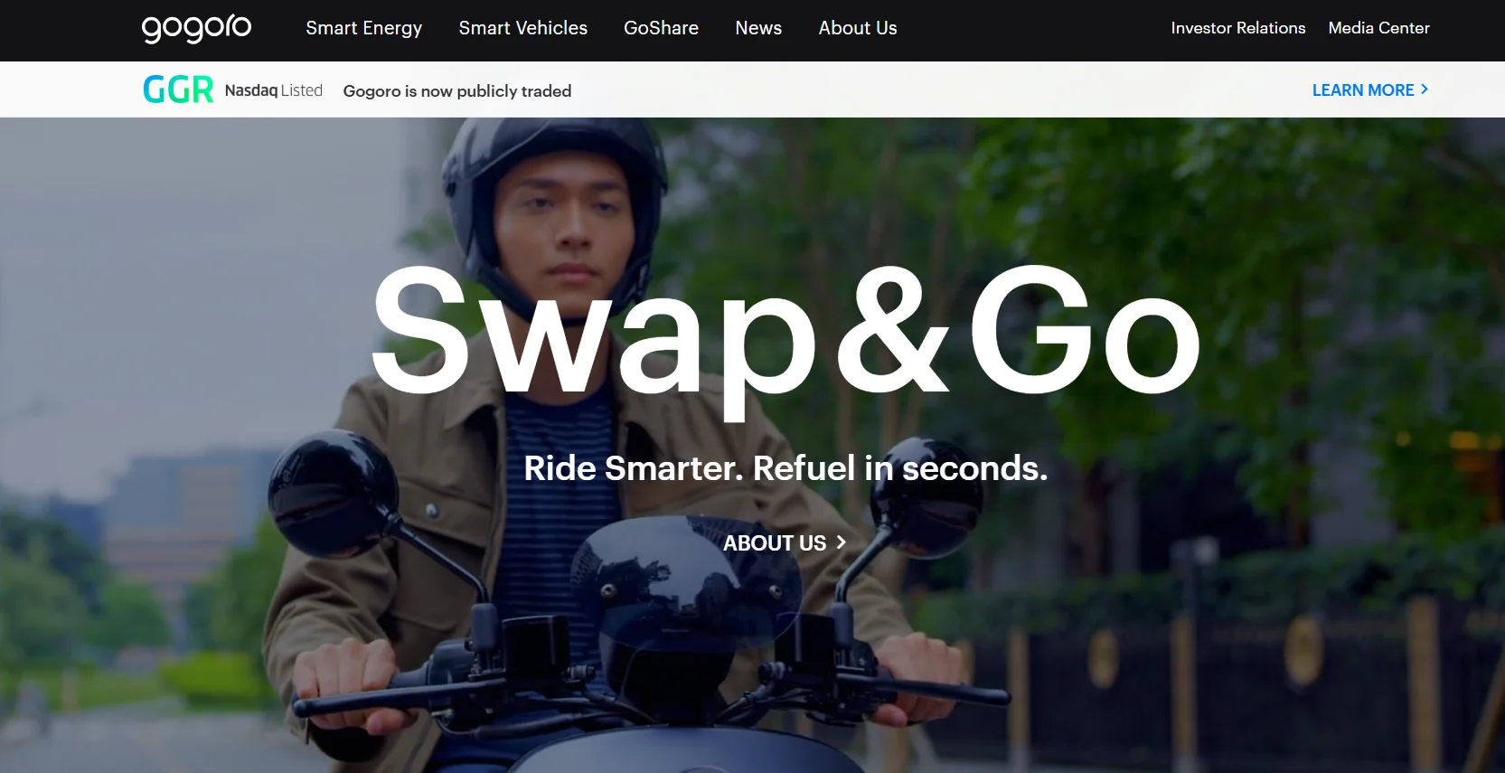
Three lines. That's the whole pitch.
"Swap and Go. Ride Smarter. Refuel in seconds." Gogoro's entire competitive advantage, the fact that you swap a battery in seconds instead of waiting to charge, lands in under ten words. Behind it, a full-bleed cinematic shot of a rider in motion. The typography is massive. The page doesn't ask for much from you because it doesn't need to.
The dark layout lets the white font and a bright green Nasdaq banner cut through without fighting each other. Premium without having to say it.
10. Monday.com

Upcoming features are a tricky thing to communicate. Too much text and it feels like a roadmap nobody asked to read.
Monday.com breaks their AI capabilities into distinct vertical blocks: AI Blocks, Digital Workforce, Product Power-ups. You scan it in seconds. Each block is its own thing, not a bullet point buried in a paragraph.
The 3D avatars soften what could otherwise feel like a pretty intimidating concept. AI automation sounds clinical. A friendly illustrated character called "monday Expert" makes it feel approachable. The "Coming Soon" tags do something useful too: they give existing users a reason to stay curious about what's next.
11. Omsom

There's no easing into this homepage. Blazing yellow, deep reds, flash-photography style. The copy matches the visual: "PROUD + LOUD ASIAN FLAVORS."
Everything is turned up. On purpose.
The steaming bowl of noodles with chopsticks caught mid-action isn't styled to look elegant. It's styled to make you hungry right now. There's nothing generic or templated about it. The cultural personality isn't hinted at; it's the whole point of the page.
12. Airbnb

Airbnb skips the homepage copy entirely and drops you straight into listings.
No headline about belonging, no brand manifesto above the fold. Just a grid of real locations, immediately. They've figured out that their users shop with their eyes, and the fastest way to trigger that is to get out of the way and show them something worth looking at.
The category icons along the top are doing something clever. Amazing views, National parks, Surfing, Icons. They're not filters in the traditional sense. They're prompts. Each one plants a version of a trip in your head before you've consciously decided you're planning one. Browsing starts feeling less like searching and more like dreaming.
13. Loom

"This meeting could have been an email" is something people feel before they can articulate it. Loom's headline, "One video is worth a thousand words," catches that frustration mid-thought. No feature list, no capability overview. Just the emotional case for the product, stated plainly.
The CTAs are worth looking at closely. "Get Loom for free" alongside "Install Chrome Extension" gives two different types of visitors two different entry points. One for the person who wants to explore, one for the person who just wants to start using it right now. Most brands offer one generic button and wonder why signups are low.
14. Miro

Most homepages try to look clean and confident. Miro opens with chaos on purpose.
A visual of overlapping tabs, cluttered tools, piling tasks. Then the question: "How are this many productivity tools productive?" It reads like someone pulled the thought directly out of your head on a bad Monday morning.
The bet they're making is that showing you the problem feels more convincing than selling you the solution. And it works, because by the time you get to what Miro actually does, you're already nodding.
15. Uber

Uber doesn't need to explain what it does. Anyone landing on their homepage already knows.
So the page skips the pitch entirely and gives you a login block. Book a ride or check your account. That's it. No scrolling through brand values, no lifestyle photography to wade through first.
The vector illustration on the right pulls its weight without demanding attention. It communicates travel, airports, movement, without a single word of copy doing that job. The page just gets out of the way.
16. Webflow

Webflow builds websites. So their homepage has to be one of the best websites on the internet. There's no way around that.
Instead of telling you what's possible, they show you. Right inside the hero section sits a fully realized mock site called "Fusionbeat" — dark mode aesthetic, modern typography, analytics overlays, session tracking UI. It looks like something a funded startup actually launched.
The argument being made isn't written anywhere on the page. It's visual: this is what you can build here, without writing code. Nobody had to say it. You already saw it.
17. BiC

A utility lighter is about as low-engagement as a product gets. It lives in a junk drawer. Nobody thinks about it until they need it.
BIC sidesteps that entirely. Their EZ Reach campaign page ties the lighter directly to Snoop Dogg and Martha Stewart — the "S.W.E.D." license plate, the polaroid photos, the whole visual language of that partnership. The product sits next to oysters and candles. The CTA isn't "buy a lighter." It's "Choose Your Mood Dining Experience."
That's the move. They're not selling specs. They're selling the occasion. And suddenly a junk-drawer item is an essential part of setting the scene.
18. Hotjar

Abstract analytics features are genuinely hard to explain without losing people.
Hotjar doesn't try to explain. They show. On the left side of the page: a live heatmap, bright and specific, showing exactly where users are clicking on a real website. On the right: a clean accordion navigation — Observe, Ask, Engage — that labels what you're looking at.
The moment someone reads "Heatmaps," their eyes slide left and they're already looking at one. Nothing is left to imagination. Product comprehension happens fast because the page is built around that sequence, not around a list of features that require you to picture them yourself.
19. Mailchimp

"Mailchimp gets it done" is a confident headline. Most email platforms don't go near that kind of directness.
The sub-headline is where the real work happens: "the #1 email provider for deliverability." For anyone who's dealt with emails landing in spam, that line hits immediately. It's not a feature. It's the thing email marketers actually worry about, named directly.
The promo bar at the top, "Save 50%", stays out of the way of the main message but catches every window shopper who's still weighing the cost. The laptop mockup on the right shows a simplified, uncluttered interface. Not every feature visible at once. Just enough to signal that onboarding won't be a project.
20. Notion

Notion built a recognizable visual language before most productivity tools thought that mattered.
The custom black-and-white line illustrations are warm and slightly playful. They make a fairly complex database tool feel approachable, the kind of thing you'd actually want to open on a Monday morning. "The happier workspace" lands differently when the page itself looks happy.
But Notion isn't just selling to individuals journaling their thoughts. They're selling to enterprises. So right below the illustrations: Toyota, OpenAI, Figma, Ramp. The balance is deliberate. Friendly enough for a personal project, credible enough for a company running serious operations. Both audiences see themselves on the same page without either feeling like an afterthought.
Final Thoughts
The examples we shared should inspire your design and demonstrate how diverse industries approach engagement, aesthetics, and functionality, leading the web design trends. Take these homepage design examples as a starting point and apply the insights to your own website to better engage your target customers and boost conversions. By implementing clear calls to action, optimizing for mobile, and focusing on trust-building elements, you can create a homepage that draws visitors in and converts them into loyal customers.
Let us know how Evolv can help you deliver your website design ideas that will stick with your audience!
Also, check out our blog and be updated with the latest insights on brand-building and digital marketing!
FAQs
How do I design my home page?
Start by defining its primary goal (e.g., generate leads, inform) and your audience's key need. Use a clear visual hierarchy to guide visitors from a strong headline and value proposition to clear calls-to-action, ensuring fast load times and mobile responsiveness.
What are the latest homepage trends?
Current trends include bold, minimalist hero sections with ample whitespace, immersive full-screen video backgrounds, micro-interactions and subtle animations, dark mode options, and a focus on inclusive, accessible design and authentic imagery over stock photos.
What are the 7 website design elements?
Seven essential elements are: 1. Layout & Grid, 2. Color Palette, 3. Typography, 4. Imagery/Visuals, 5. Navigation, 6. White Space, and 7. Interactive Elements (like buttons and forms). Together, they create a cohesive, functional, and aesthetic user experience.
What are common homepage mistakes?
Common mistakes include unclear value proposition, weak or missing calls-to-action, cluttered layout, slow loading speed, neglecting mobile design, and using generic stock imagery that fails to connect the brand authentically with visitors.

Carl Undag
Evolv helps companies scale their brand without the headache of hiring full-time employees or unreliable freelancers. Our flat-rate monthly subscription gives you on-demand access to a dedicated creative team, letting you submit branding tasks with zero compromise on speed or talent.
